

Designing a book-cover
This is a graphic design assignment in school. Create a book cover for the amazing «Rita Hayworth & Shawshank Redemption». What a fun and exiting opportunity.

This moodboard is inspired with photos from Pinterest. This is the inspiration I used to create a book cover.
Btw – have you seen Shawshank Redemption? (Frihetens regn på norsk). The best movie almost ever made.
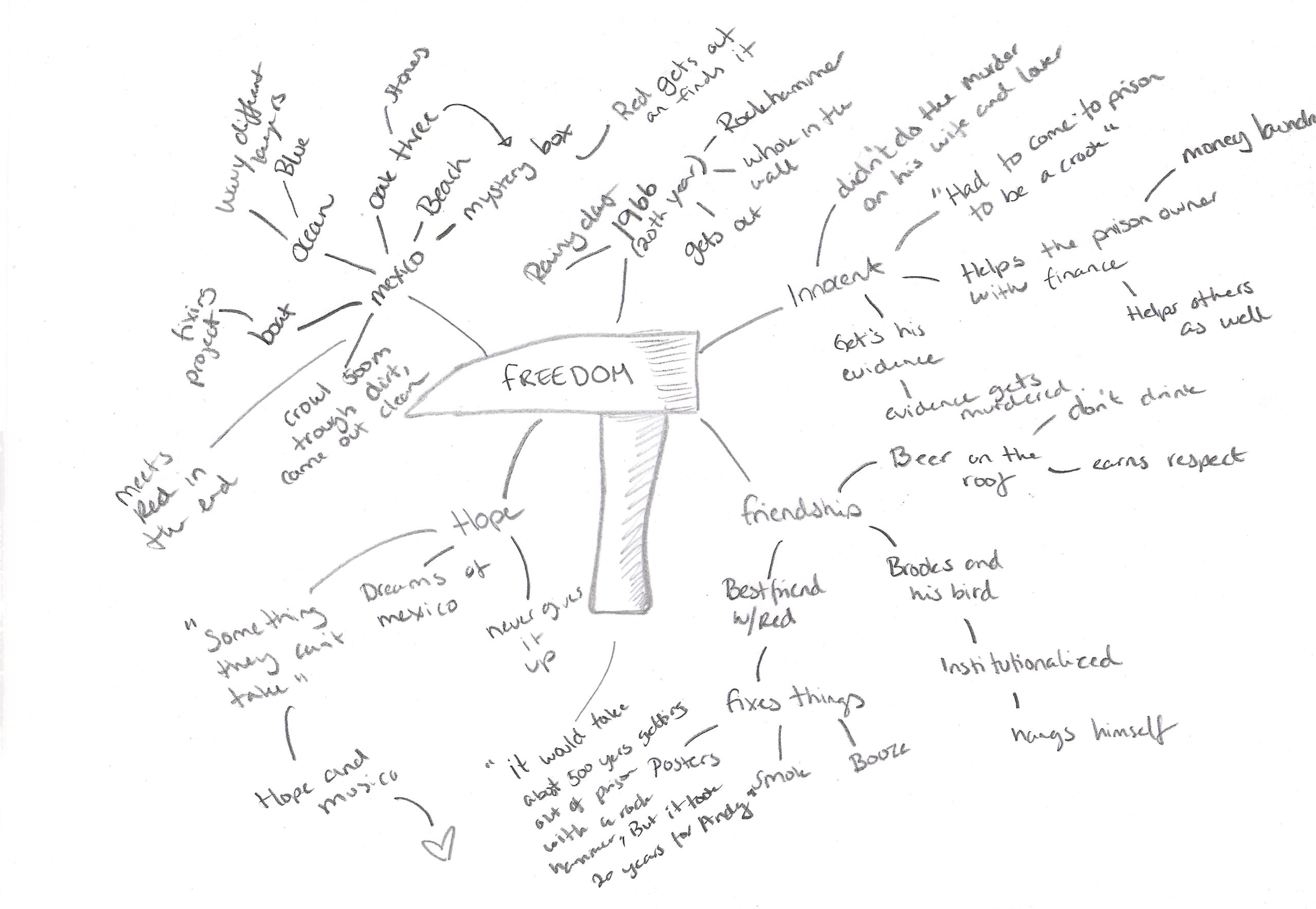
Before creating the cover, I had to come up with some ideas.
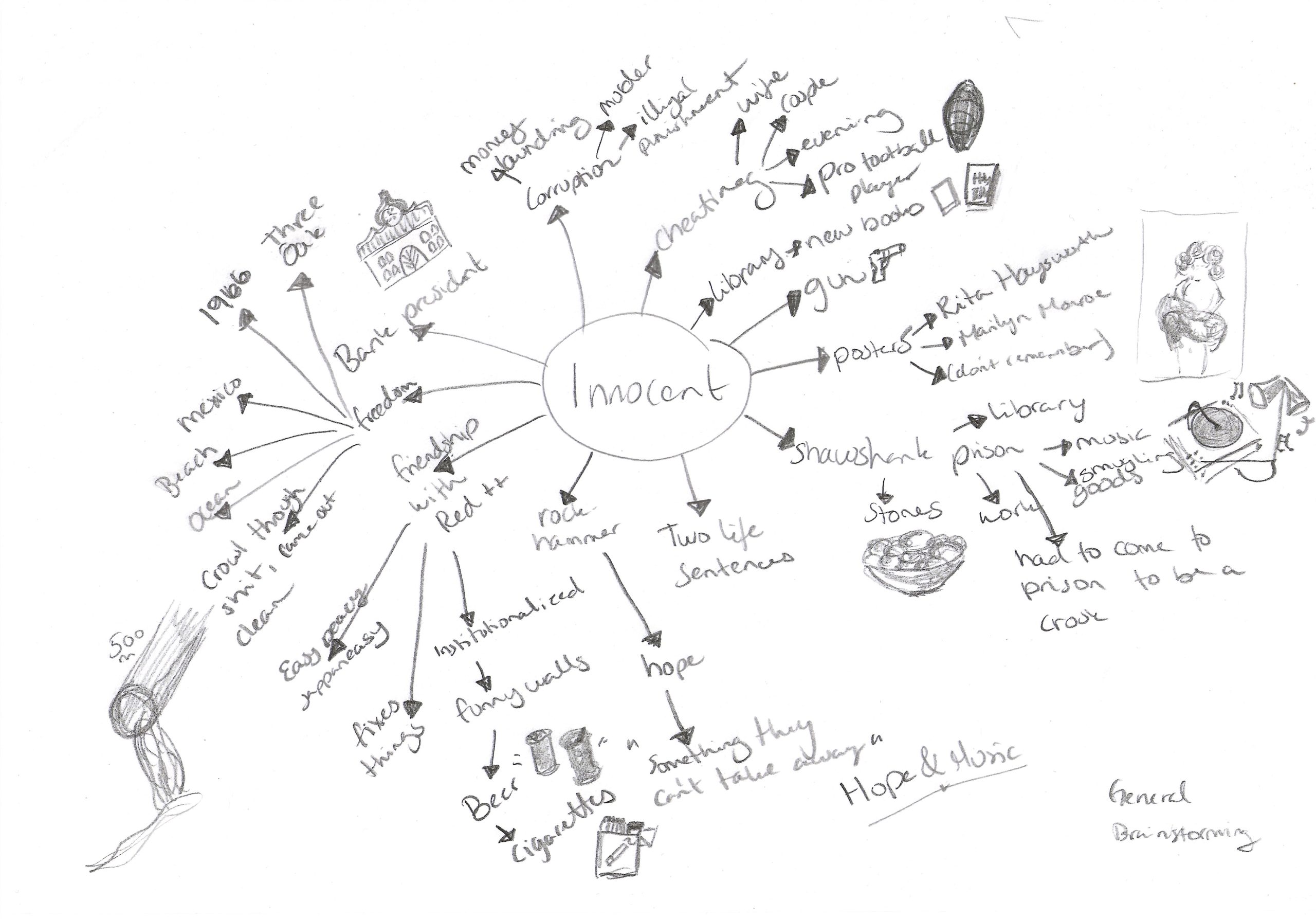
I used several mind maps to gather the information I both new and had to research to get. A lot of work in this process.

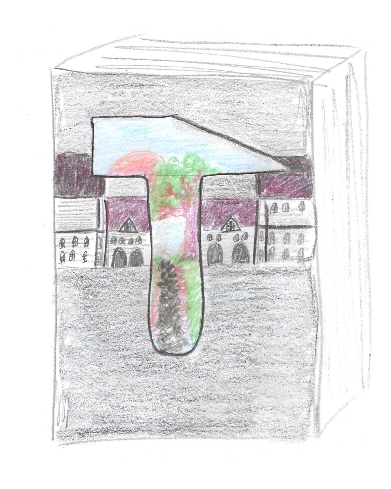
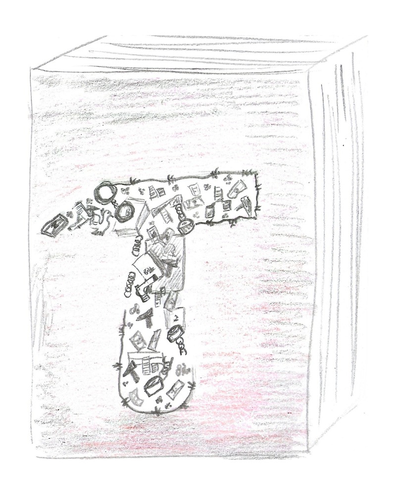
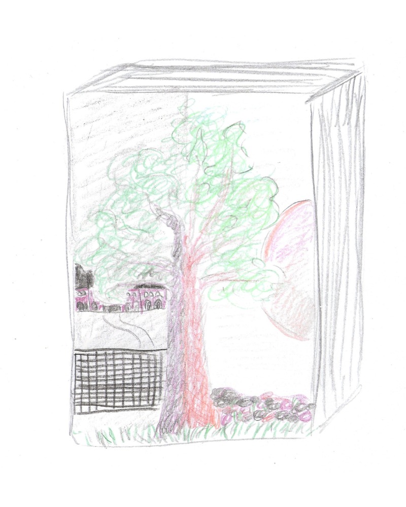
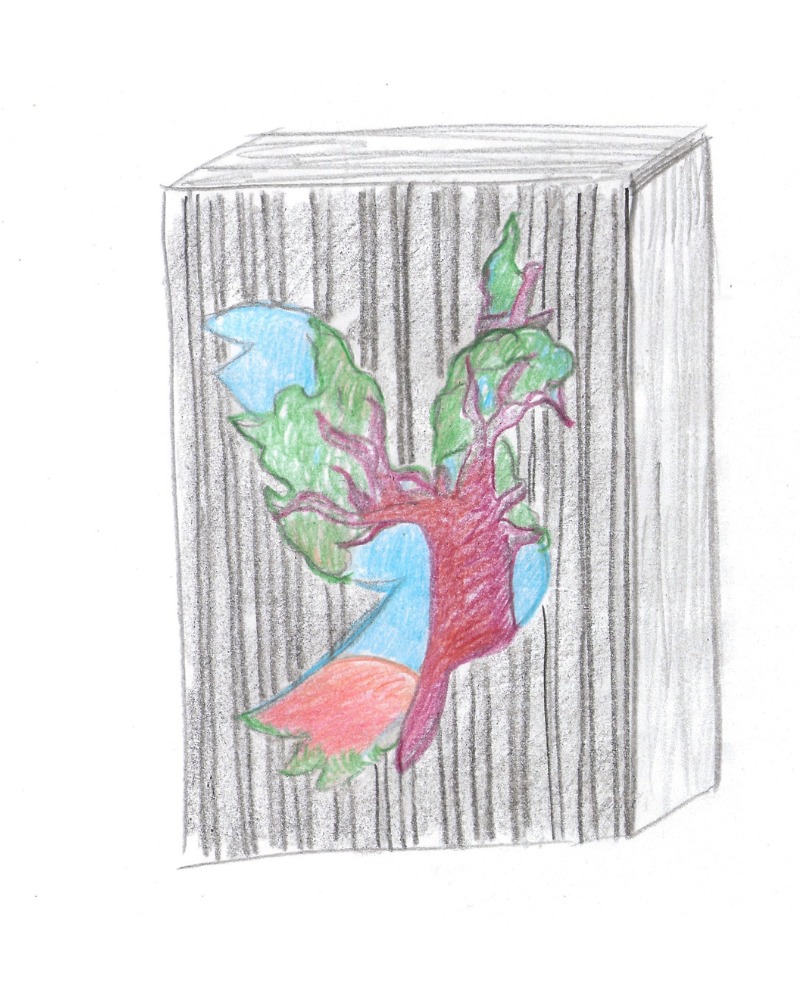
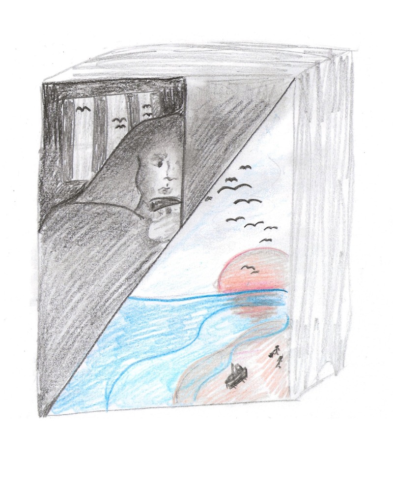
And then I started the sketching on paper.

After doing the sketching I had to find the colors and typography that I wanted to use on the cover. I choose to find two different typography on dafonts.com. And jumped in to Photoshop to try and design something out of these sketches. Different fonts and color palettes:


The start of the book cover journey…
So, the thoughts about this example is that the bird symbolizes freedom. (Flying dove).. In the background you’ll see the prison, and in the book this «oak» tree has a big role.
Now, this example is showing too much information. And the rock-hammer (the main symbol) is a bit to small.
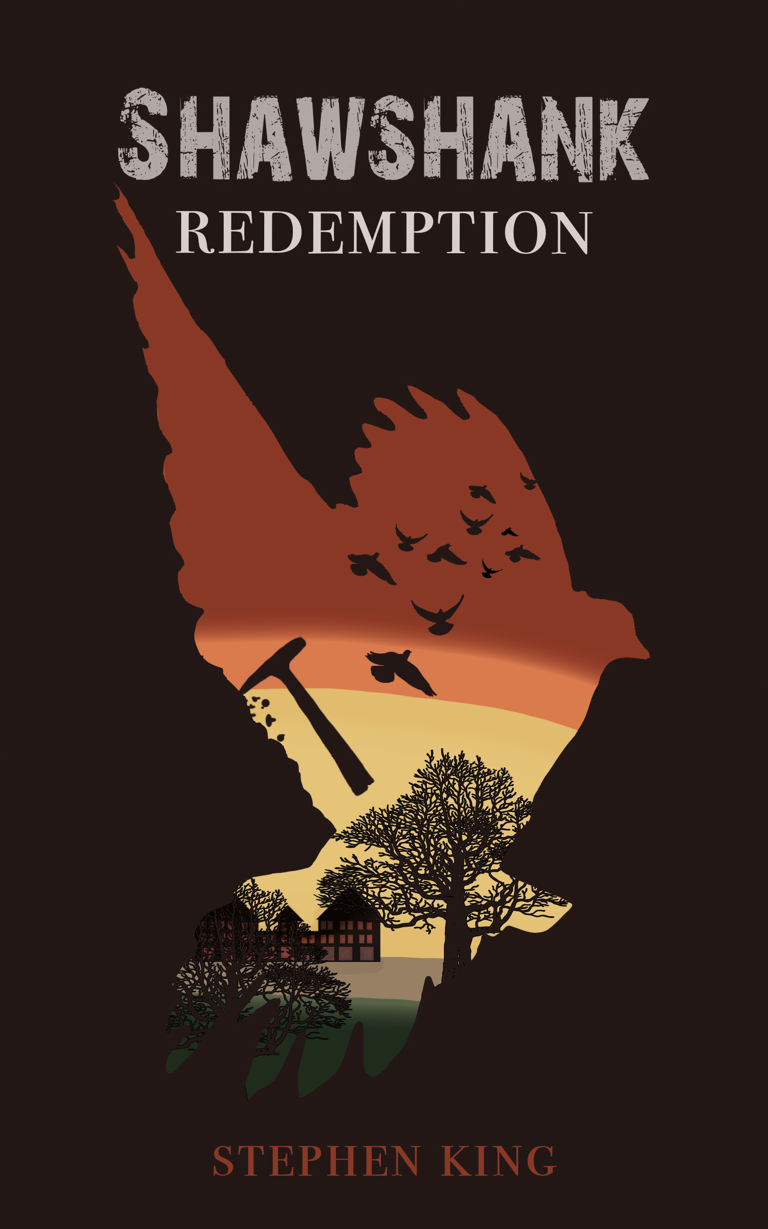


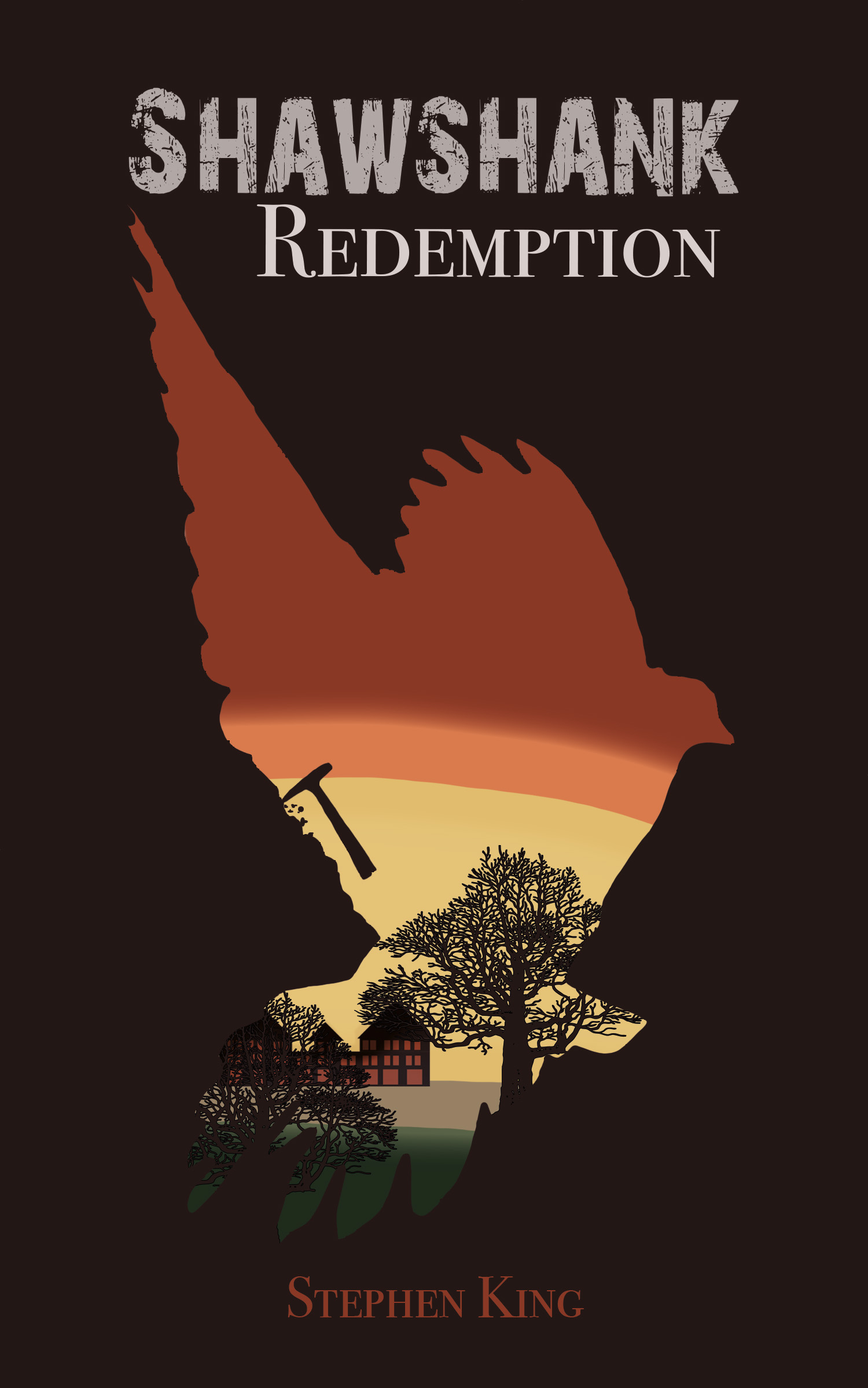
A lot of changes later….. The rock-hammer is much bigger, the prison is gone and freedom calls. The rocks falling down ends up being flying doves – and also the typography here is changed. It’s a way better match. I’ve used the gestalt principles called Figure ground and common fate. The finished Results:


What do you think of the finished results?
I’ve got a lot to learn, but I was happy with the results after all. Would you like to see more of these behind the scenes?