

Designing a logo
This was such a fun assignment. We had to design a logo to a business up north in Lofoten.
Here are some costumer information:
“Fra Gård” is a farm shop located in Svolvær, Lofoten. It’s owned by Silje and Ole Kåre Jørgensen, a grandmother and a grandson. The shop has ben running for over 25 years, and Ole Kåre are taking over the family business to modernise it in the future.
They stand out by selling fresh produced food, baked goods, and support local artists handwork by selling their work in the shop. This could be candles, wood-carved souvenirs, ceramics and pottery.
Fra Gård is located in the heart of sentrum, and both tourists and locals love to use this store.
They have several goals for Fra Gård, and this rebranding is to attract even more young tourists and creatives from all over the world to their store, using the power of social media and a recognizable brand.
And because of that, they would like a logo they can use in various ways. The logo needs to work for the store, their famous jam, hosting their creative workshops and creating a unique presence for the online shop.
Fra Gård thinks that the local creative artists are their biggest asset, and they want to continue to support them and follow the creative workshop direction. The logo should reflect this. Ole Kåre believes that they can give tourists a more authentic, personalized shopping experience true to the region and the nature of the locals.
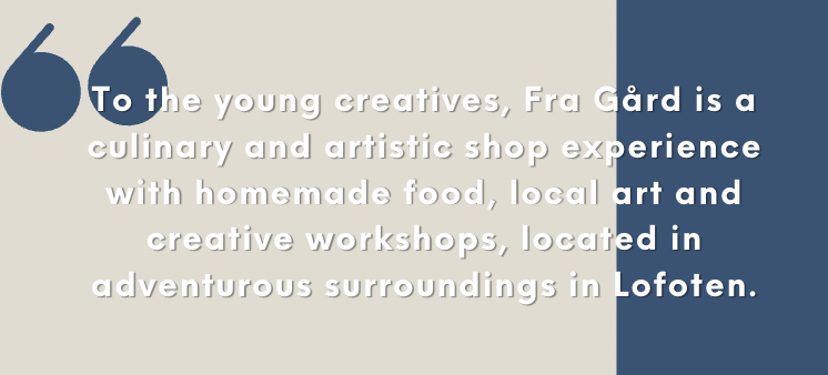
What makes Fra Gård unique is by creating an understandable brand, focusing on all the riches that Fra Gård provides, from having unique creative events in a marvelous locations, talking about the artist they support and their different stories, and presenting the local food like you almost can smell it from the mobile screen. It’s a package with taste, feels and vibes in it, that really talks towards the young and creative people, tourists and locals.
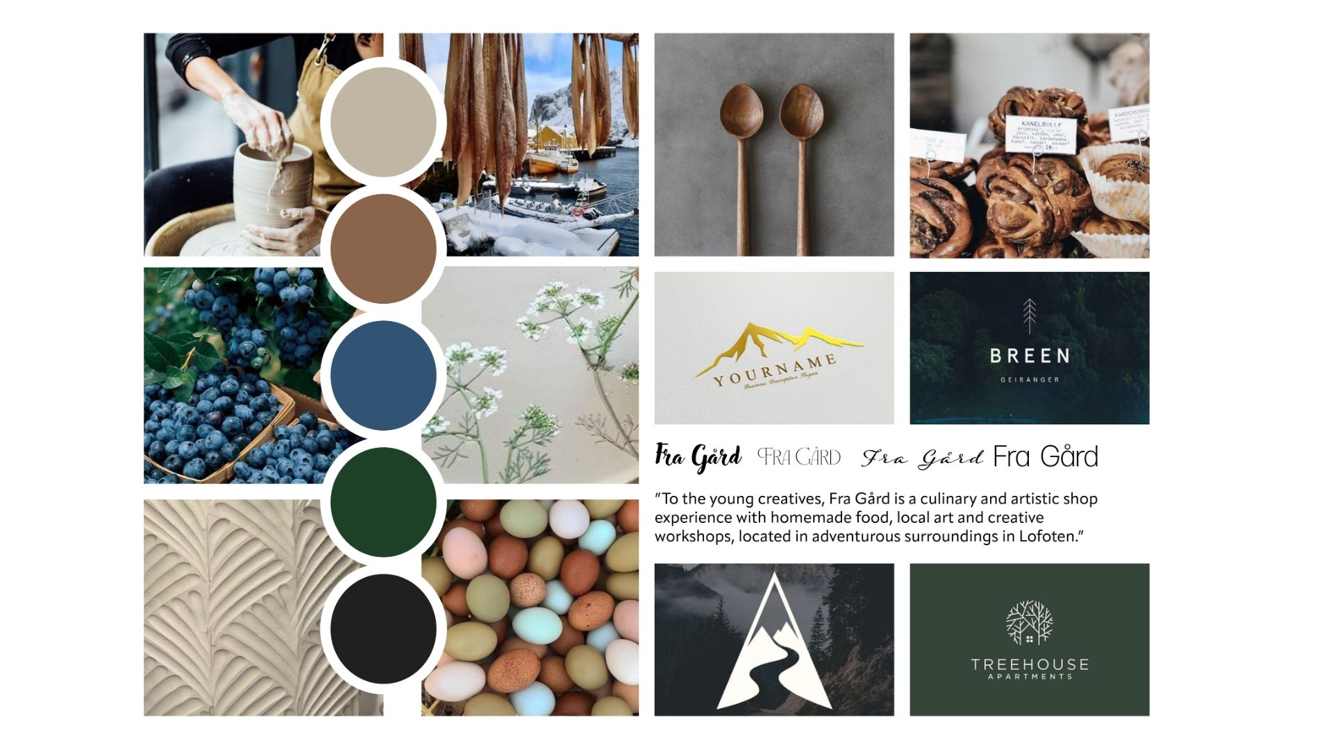
I’ve created a moodboard to get inspired from when creating the logo. This is so much fun. Finding the colors, typography and visual effects that speaks the brands voice. Doing this gave me so many ideas for the logo. The next thing I had to do was researching the target market and finding the brand statement for Fra Gård.
Next up I started the sketching and working with the ideas that I got. Trying to do something that wasn’t to obvious, but still something that would be remembered.

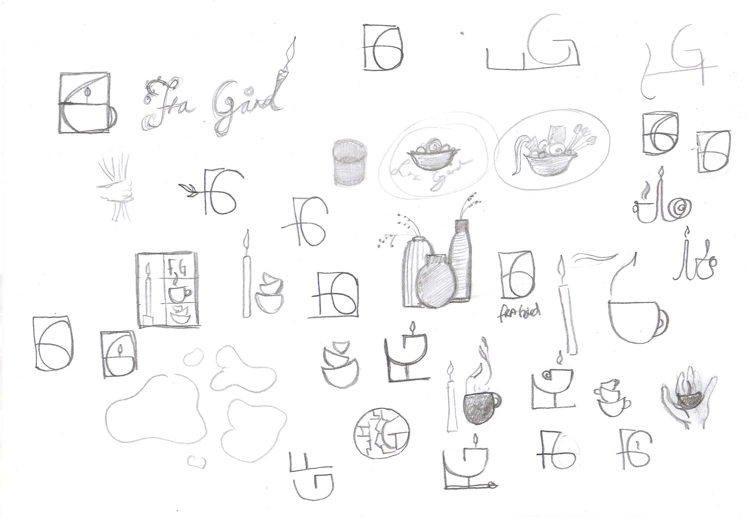
Working with the sketches
The next thing I did was take a few drafts and try to re-invent them in illustrator. This was a challenging thing, specially because of the programs many features and I’m not a pro yet.
Tough a lot of fun while mastering (finally) the «pen tool» in illustrator. What a job!
I got some feedback that made me want to go away from some of these drafts.
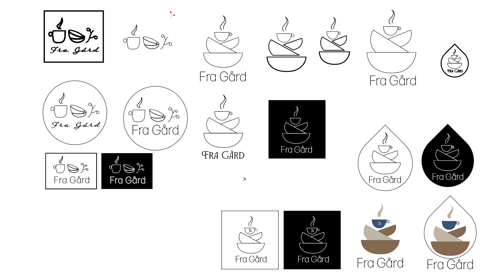
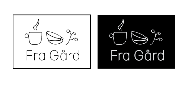
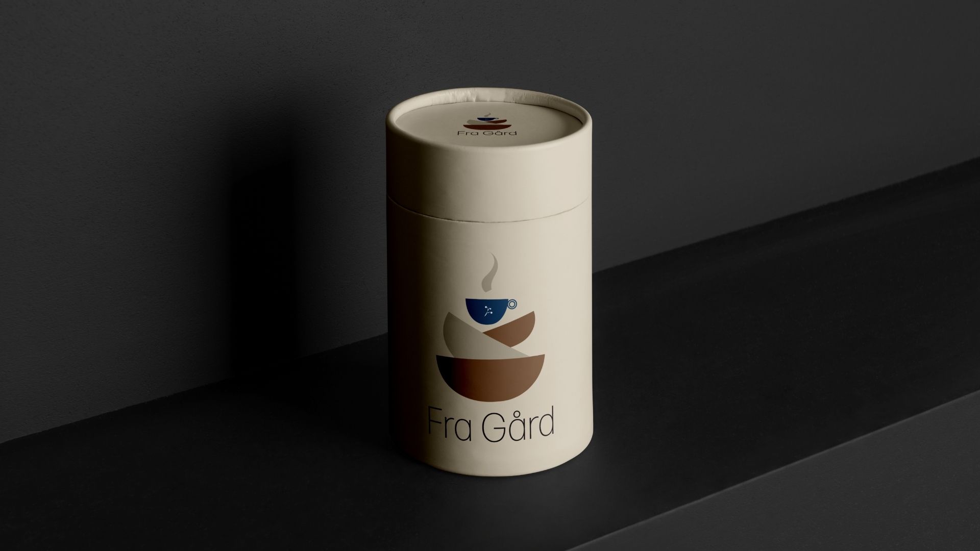
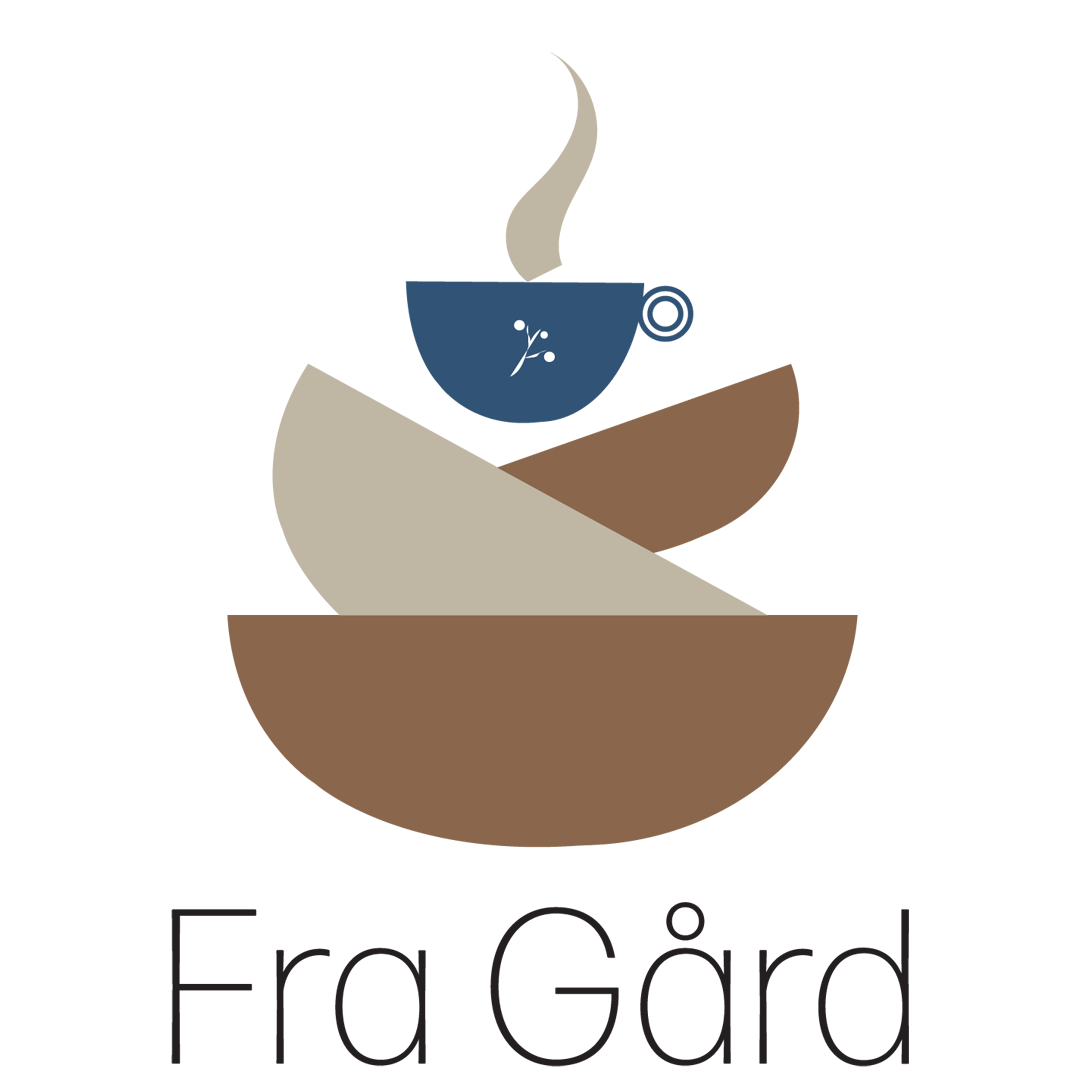
The final logo results

The logo is in an egg-shape and contains wooden bowls and a mug with a little detail in it.
Fra Gård wants to produce their own jam of cranberries. So this is symbolizing that.
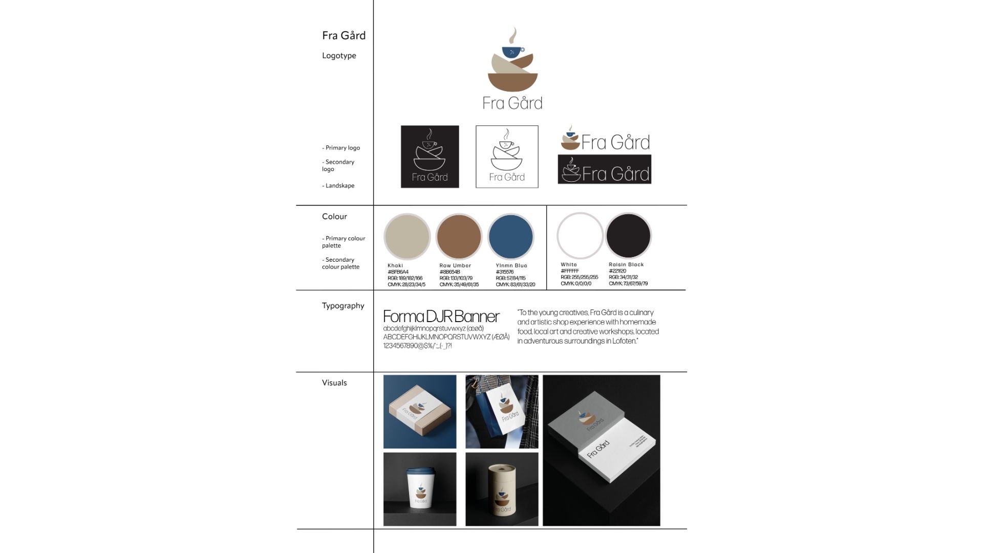
This is the brand style sheet that explains the font, colors, logos and shows in visuals how it looks like.
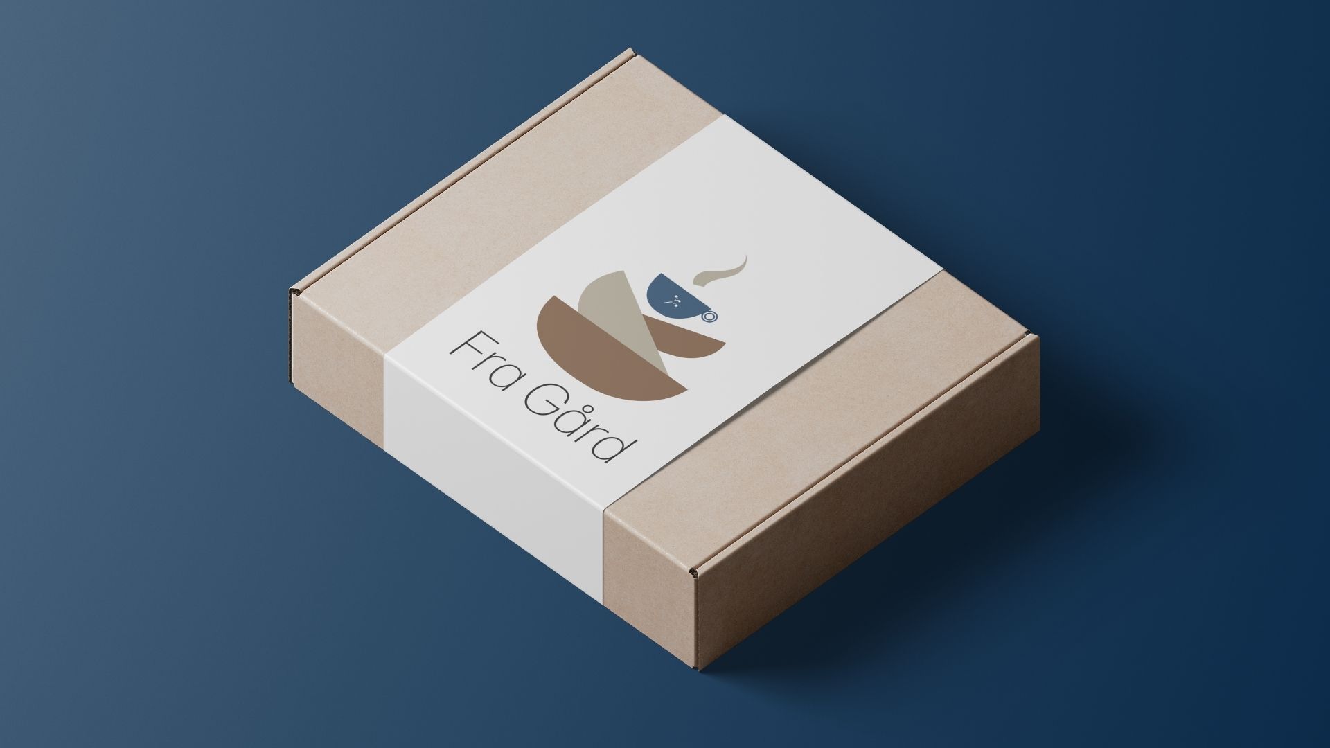
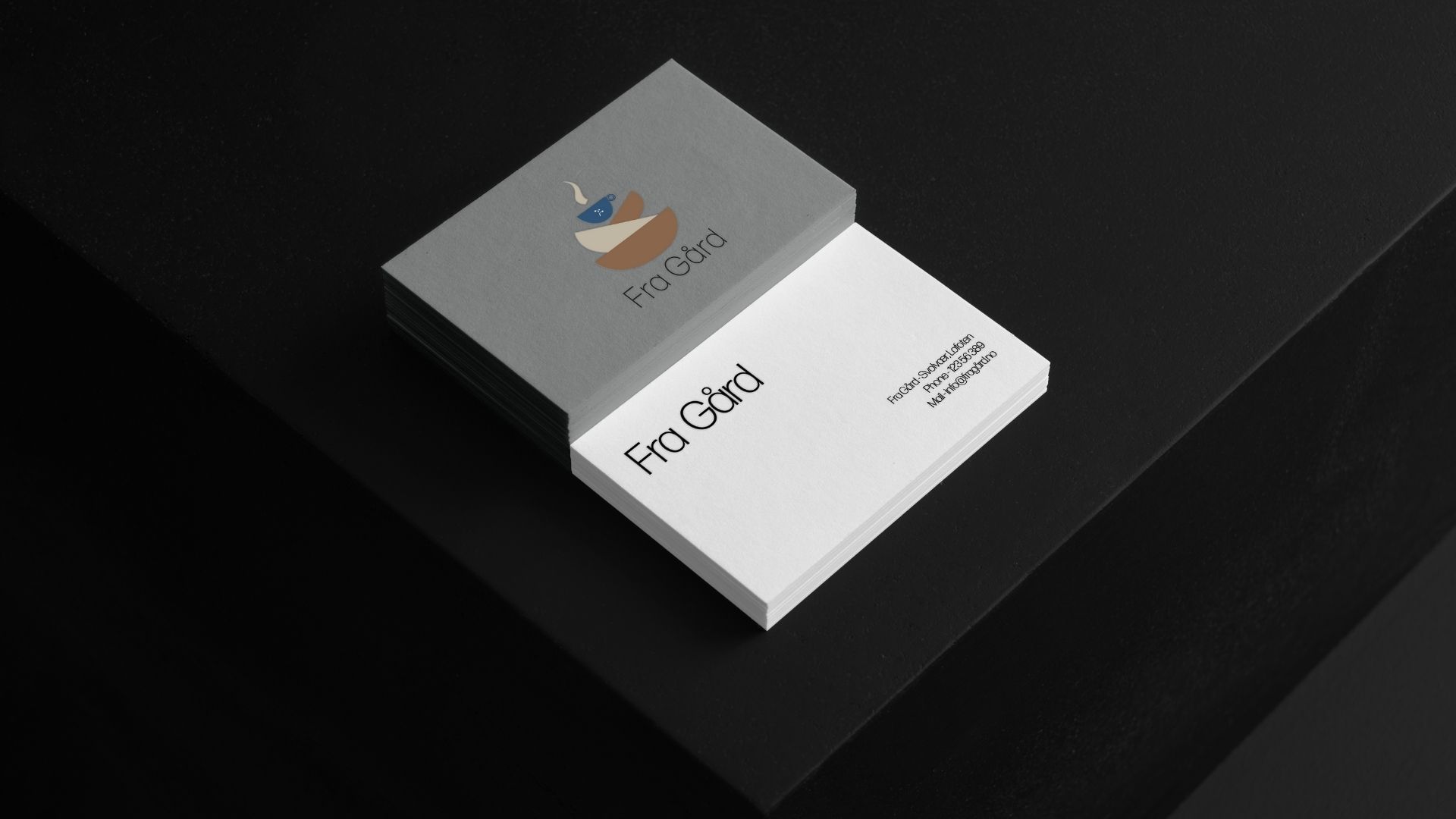
More visuals….


Fra Gård also wanted an animated logo – so this is what I came up with, using photoshop to animate the logo I’ve created.
All in all – such a fun assignment. And I can’t wait until the next branding assignment comes up!
This is so much fun.